SQLPage v0.25.0 documentation
If you are completely new to SQLPage, you should start by reading the get started tutorial, which will guide you through the process of creating your first SQLPage application.
Building an application with SQLPage is quite simple. To create a new web page, just create a new SQL file. For each SELECT statement that you write, the data it returns will be analyzed and rendered to the user. The two most important concepts in SQLPage are components and parameters.
- components are small user interface elements that you can use to display your data in a certain way.
- top-level parameters are the properties of these components, allowing you to customize their appearance and behavior.
- row-level parameters constitute the data that you want to display in the components.
To select a component and set its top-level properties, you write the following SQL statement:
SELECT 'component_name' AS component, 'my value' AS top_level_parameter_1;
Then, you can set its row-level parameters by writing a second SELECT statement:
SELECT my_column_1 AS row_level_parameter_1, my_column_2 AS row_level_parameter_2 FROM my_table;
This page documents all the components provided by default in SQLPage and their parameters. Use this as a reference when building your SQL application. If at any point you need help, you can ask for it on the SQLPage forum.
If you know some HTML, you can also easily create your own components for your application.
components
The "card" component
A grid where each element is a small card that displays a piece of data.
Top-level parameters
columns
description
description_md
title
Row-level parameters
title
active
background_color
class
color
description
description_md
embed
A url whose contents will be fetched and injected into the body of this card.
This can be used to inject arbitrary html content, but is especially useful for injecting
the output of other sql files rendered by SQLPage. For the latter case you can pass the
?_sqlpage_embed query parameter, which will skip the shell layout
embed_mode
Set to 'iframe' to embed the target (specified through embed property) in an iframe. Unless this is explicitly set, the embed target is fetched and injected within the parent page. If embed_mode is set to iframe, You can also set height and width parameters to configure the appearance and the sandbox and allow parameters to configure security aspects of the iframe. Refer to the MDN page for an explanation of these parameters.
footer
footer_link
footer_md
icon
link
style
top_image
Example 1
The most basic card
select
    'card' as component;
select
    'A' as description;
select
    'B' as description;
select
    'C' as description;
Result
Example 2
A card with a Markdown description
select
    'card' as component,
    2      as columns;
select
    'A card with a Markdown description' as title,
    'This is a card with a **Markdown** description.

This is useful if you want to display a lot of text in the card, with many options for formatting, such as
 - **bold**,
 - *italics*,
 - [links](index.sql),
 - etc.' as description_md;
Result
A card with a Markdown description
This is a card with a Markdown description.
This is useful if you want to display a lot of text in the card, with many options for formatting, such as
- bold,
- italics,
- links,
- etc.
Example 3
A beautiful card grid with bells and whistles, showing examples of SQLPage features.
select
    'card'                     as component,
    'Popular SQLPage features' as title,
    2                          as columns;
select
    'Download as spreadsheet'  as title,
    '?component=csv#component' as link,
    'Using the CSV component, you can download your data as a spreadsheet.' as description,
    'file-plus'                as icon,
    'green'                    as color,
    'SQLPage can both [read](?component=form#component) and [write](?component=csv#component) **CSV** files.' as footer_md;
select
    'Custom components'      as title,
    '/custom_components.sql' as link,
    'If you know some HTML, you can create your own components for your application.' as description,
    'code'                   as icon,
    'orange'                 as color,
    'You can look at the [source of the official components](https://github.com/lovasoa/SQLpage/tree/main/sqlpage/templates) for inspiration.' as footer_md;
Result
Popular SQLPage features
Example 4
Short information notices
select
    'card' as component;
select
    'This post is also available in [german](?lang=de).' as description_md,
    TRUE       as active,
    'language' as icon;
Result
This post is also available in german.
Example 5
A gallery of images.
select
'card' as component,
'My favorite animals in pictures' as title,
3 as columns;
select
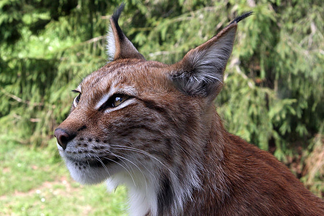
'Lynx' as title,
'The **lynx** is a medium-sized **wild cat** native to Northern, Central and Eastern Europe to Central Asia and Siberia, the Tibetan Plateau and the Himalayas.' as description_md,
'https://upload.wikimedia.org/wikipedia/commons/thumb/d/d8/Lynx_lynx-4.JPG/640px-Lynx_lynx-4.JPG' as top_image,
'star' as icon;
select
'Squirrel' as title,
'The **chipmunk** is a small, striped rodent of the family Sciuridae. Chipmunks are found in North America, with the exception of the Siberian chipmunk which is found primarily in Asia.' as description_md,
'https://upload.wikimedia.org/wikipedia/commons/thumb/b/be/Tamias-rufus-001.jpg/640px-Tamias-rufus-001.jpg' as top_image;
select
'Spider' as title,
'The **jumping spider family** (_Salticidae_) contains more than 600 described genera and about *6000 described species*, making it the largest family of spiders with about 13% of all species.' as description_md,
'https://upload.wikimedia.org/wikipedia/commons/thumb/a/ab/Jumping_spiders_%28Salticidae%29.jpg/640px-Jumping_spiders_%28Salticidae%29.jpg' as top_image;Result
My favorite animals in pictures
Lynx
The lynx is a medium-sized wild cat native to Northern, Central and Eastern Europe to Central Asia and Siberia, the Tibetan Plateau and the Himalayas.

Squirrel
The chipmunk is a small, striped rodent of the family Sciuridae. Chipmunks are found in North America, with the exception of the Siberian chipmunk which is found primarily in Asia.

Spider
The jumping spider family (Salticidae) contains more than 600 described genera and about 6000 described species, making it the largest family of spiders with about 13% of all species.
Example 6
Beautifully colored cards
select
    'card'                      as component,
    'Beautifully colored cards' as title,
    3                           as columns;
select
    'Red card'              as title,
    'red'                   as color,
    'red-lt'                as background_color,
    'Penalty! You are out!' as description,
    'play-football'         as icon;
select
    'Green card'  as title,
    'green'       as color,
    'green-lt'    as background_color,
    'Welcome to the United States of America !' as description,
    'user-dollar' as icon;
select
    'Blue card'     as title,
    'blue'          as color,
    'blue-lt'       as background_color,
    'The Blue Card facilitates migration of foreigners to Europe.' as description,
    'currency-euro' as icon;
Result
Beautifully colored cards
Red card
Green card
Blue card
Example 7
Cards with remote content
select
    'card' as component,
    'Card with embedded remote content' as title,
    2      as columns;
select
    'Embedded Chart' as title,
    '/examples/chart.sql?_sqlpage_embed' as embed,
    'You can find the sql file that generates the chart [here](https://github.com/lovasoa/SQLpage/tree/main/examples/official-site/examples/chart.sql)' as footer_md;
select
    'Embedded Video' as title,
    'https://www.youtube.com/embed/mXdgmSdaXkg' as embed,
    'accelerometer; autoplay; clipboard-write; encrypted-media; gyroscope; picture-in-picture; web-share' as allow,
    'iframe'         as embed_mode,
    '350'            as height;